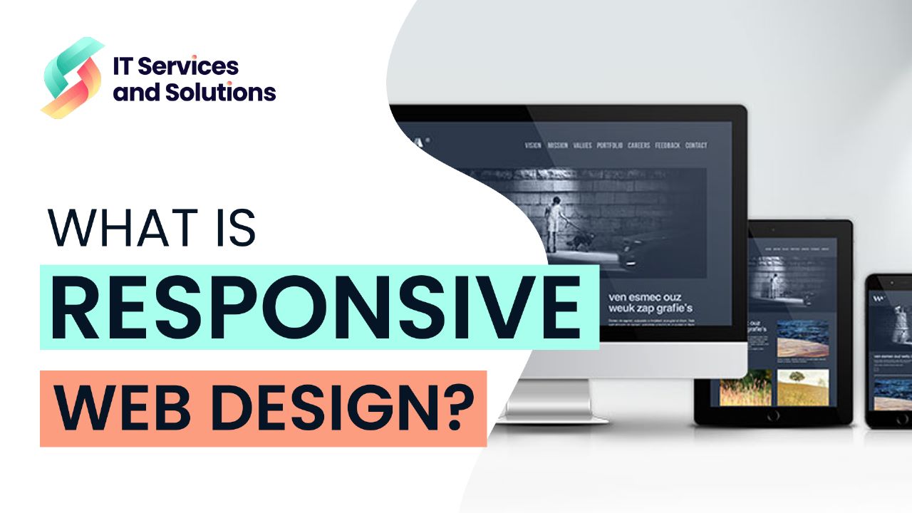
Have you ever wondered how websites adapt to different sizes of screens and devices? Responsive web design has modified how websites are developed in today’s mobile-driven world. So, what is responsive web design in general? Basically, it is an approach that allows websites to automatically modify their appearance, content, and functionality to provide the best user experience on various devices including computers, tablets, and smartphones.
It helps businesses attract a broader audience to ensure their website functions smoothly and effectively. This article will lead you to the detailed answer for what is responsive web design and how it works.
What is Responsive Web Design?
Responsive web design means to make your website flexible in a way that it looks pretty good on all devices be it a laptop or a smartphone. Whenever a user opens the website on any device it automatically modifies its appearance, layout, and functionality depending on the screen size of the device they are using.
It is an innovative approach that saves energy and time in creating separate versions of a website for different devices in order to provide a consistent and seamless across all categories of devices from desktops to smartphones.
How Responsive Web Design Works?
Responsive web design works through CSS and HTML. Here are some key points of how the RWD operates.
1- Fluid Grid System
It creates a fluid layout that adjusts the screen size so that content fits perfectly depending on the device being used.
2- Flexible Images
As images are a crucial part of web design, this CSS technique helps to resize images in a proper manner without losing their original quality.
3- Flexible Layouts
The code for the flexible layout helps rearrange website elements to get fit in various screens.
4- Media Queries
Designers use media queries to apply different styles and change screen sizes or device characteristics accordingly.
By using a fluid grid system, flexible images, flexible layout, and media queries RWD enables websites to adjust and deliver an ideal viewing and engagement experience on a variety of devices.
Why it is Important to Have a Responsive Web Design For a Website?
A responsive web design is important for any website that wants to climb to success as it helps them in the following:
- Boost SEO results
- Save money and time
- Increase conversions
- Gain a competitive edge.
It is important to have a responsive web design for your website because you never know which user is using which kind of device to view your website in this multiscreen society so, in order to attract the audience and pull customers from them responsive web design plays a vital role.
Benefits of Responsive Web Design
There are many advantages of responsive web design. The following list includes a few of the most significant ones.
1- Enhance Website Reach
As the usage of mobile phones is massive in every small and large area of the world, having a responsive web design helps gain a wider range of audience. It removes the requirement for separate mobile versions of a website and saves time and resources while ensuring a consistent experience for all devices.
2- Better User Experience
No matter the device they are using, consumers may simply access and navigate a website thanks to responsive design. The content is presented in an optimized way, assuring readability and effective interaction, which boosts user engagement and satisfaction.
3- Boost for SEO
RWD has a positive impact on search engine rankings. Google nowadays is prioritizing websites with responsive web design because these websites are friendly for mobile users. A responsive design not only boosts user engagement but also increases exposure in search engine results.
4- Reduce Bounce Rates
Your consumers can’t stand a slow, challenging-to-use website. They’ll simply leave your website and visit one of your competitors if it doesn’t work on their device. The audience always wants quick answers to their queries. An RWD website reduces the chances of bounce rates with a fast and easy-to-use website.
5- Simplify Monitoring Analytics
If you have separate websites for multiple devices you need to monitor multiple analytics. As a responsive website is the only website so your analytics is only one source of data.
What to do now?
Modern web development must now include responsive web design as a fundamental component. It makes it possible for companies and people to develop user-centric websites that deliver the best user experiences on a variety of devices.
Instead of building websites specifically for each device, your responsive website rearranges the elements to fit on any screen which leads to more happy visitors and then customers. If you are interested in responsive design for your website or want one of those responsive websites for your business. We are confident that we can assist you with that. Contact ITSNS today for error-free services and a better experience.
Related FAQs
Q1) What are the two main components of responsive web design?
A1) The two basic components of responsive web design are flexible grid systems and media queries. The combination of both enables designers to do adjustments to the website for a better user experience on all devices.
Q2) How many types of responsive web design layouts are there?
A2) There are three types of responsive web design layouts that include Responsive, Fluid, and Adaptive.
Q3) Is responsive web design frontend or backend?
A3) Responsive web design belongs to frontend web development. Frontend developers are responsible for all the changes made to make the website accessible for all devices.
Q4) Is Google a responsive web design?
A4) Yes, Google is surely a responsive web design as it makes sure that its website is user-friendly for all devices across the world.